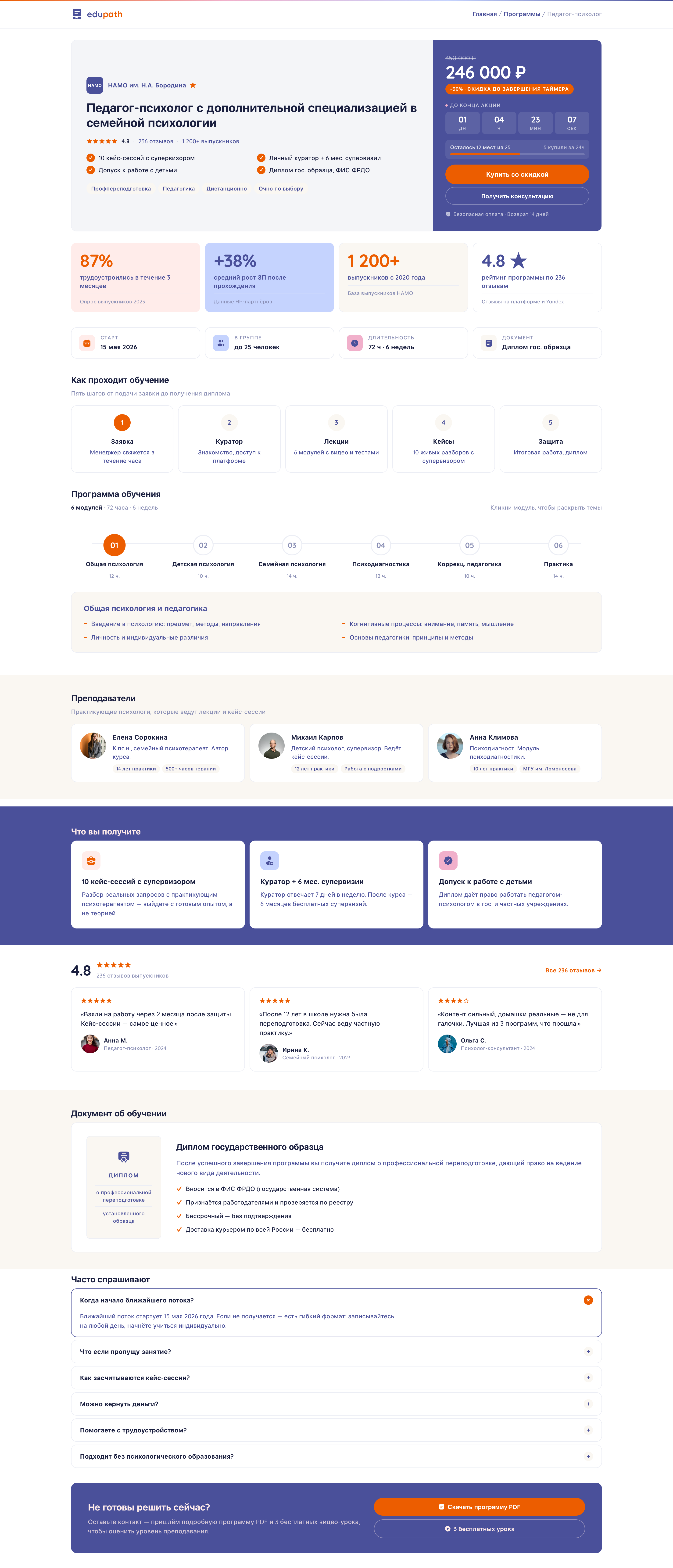
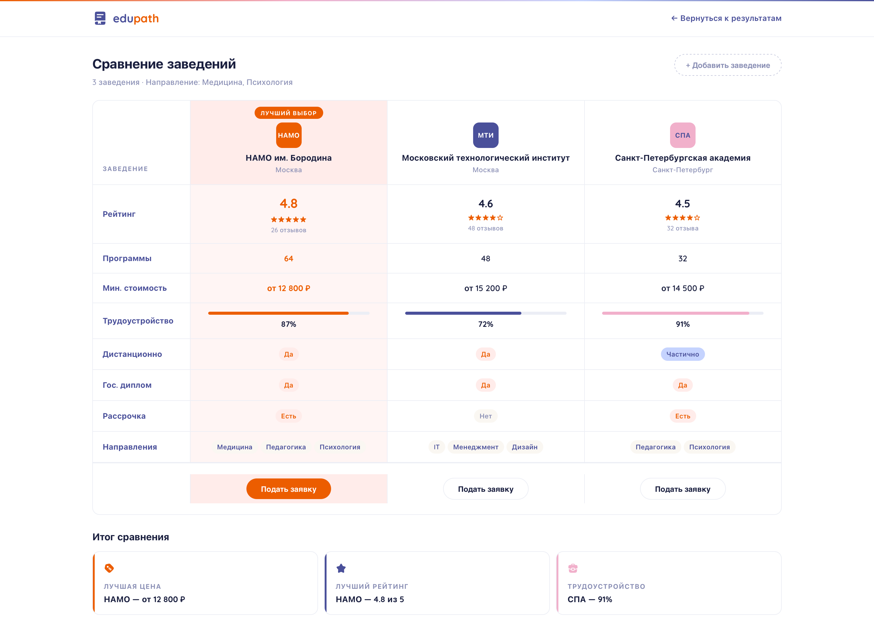
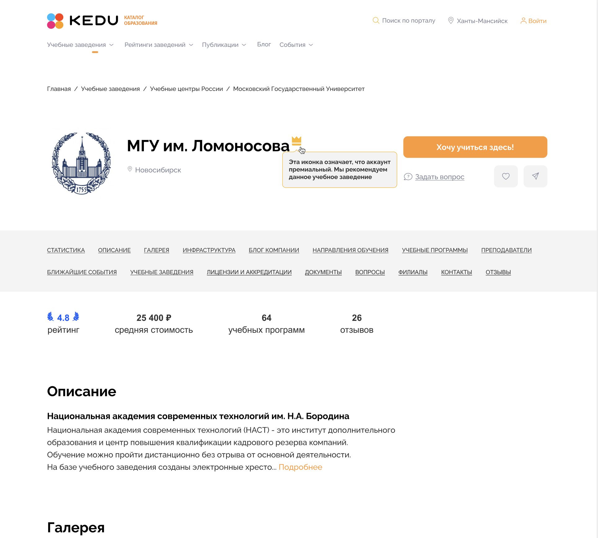
EdTech · Education catalog
edupath
Redesign of an education aggregator. Universities, courses, programs — all in one place, with warm typography and readable navigation.
edupath.io/catalog
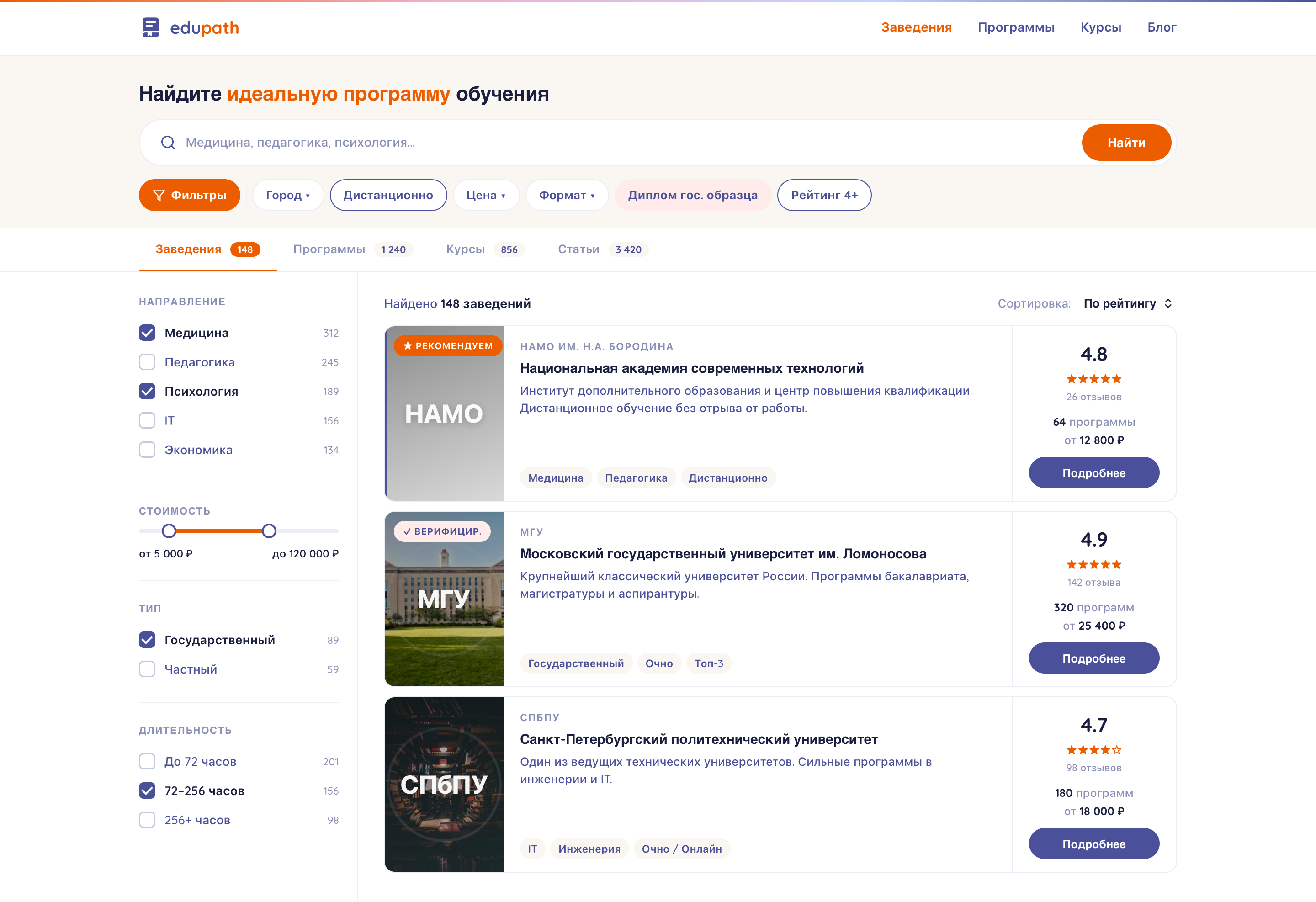
1 240
programs
4.8 ★
average rating
3
audiences
SCROLL ↓